
The first map shown above is a map of the population in the United States in 2000 that indicates the population of each county compared to one another. The darker the shade of purple in a region then the more populated the county is and vice versa. This map shows that the west coast, the north east region, and florida have pretty signifactn populations.

This second map as highlighed in the header, show the diffrence in the population in 1990 to 2000 in the United States. The darker the shade of coloring the more the population has grown in that region and the lighter(pinker) the more polarized the growing amount of people in that region has remained. By looking at the map above South California and Florda have grown the most while the Center of the country hasnt grown or has even shrunk in people in that region.

This third map shows the percenatage change in population from 1990 to 2000 in the United States. It differs from Map 2 because it shows the percentage effect on population not the amount of people in a area, so it gives us a better idea of which regions populations went through a big change. Arizona and Florida have had significant growth in population percentage and the center of the state south of the dakotas has decreased in population pwercentage.
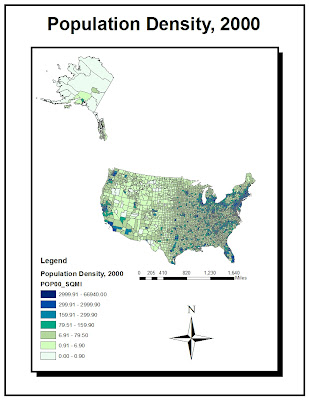
The fourth Map shows population density for the year 2000 in the United States. So it shows the number of people per area, another way to look at overall population distributuion by counties of the United States. If a large county is relatively lighter it doesnt mean neccersarily that the county is very low in population it may just mean it is not as crowded, which means if a small county is the same color it is not more populated but just more crowded. This map shows us that New York City, Chicago and Los Angeles are three very populated regions.
These four Census maps based on the United States help to show population if diffrent ways. They provide a very quick and efficient way to see how population is changing and where it is greatest. This Lab allowed me to apply some of the skills I have learned and build new skills on top of them also. It helped to show me how GIS is applied into the real world in it normal every day efficent use. Census data is very important in almost every aspect of life and displaying it in a easy and quick visual way, like the four maps above, is very useful.
No comments:
Post a Comment