Wednesday, November 28, 2012

LA Station Fire

 In this post we will be examing the Station Fire of 2009 in Los Angeles County. The station fire, burned in Los Angeles National forrest and forced thousands of evacuations and much a lot of damage. The fire Burned from August 26th until it was finally one hundred percent contained on October 16th nearly two months later. Over that period of time the station fire burned nearly 150,000 acres of land. It created a fight for firefighters that was uphill and unpredictable but luckily in the end they did contain it after some time and a lot of scares. It ranked 12th in a list of the biggest fires in California.

 
Using GIS I have created a reference map to show where the fire burned and how it changed over time in Los Angeles County. By looking at the map you can see the shaded releif model shows that the fire gre rapidly in the first week. On the August 29th about 7,000 acres had burned and by September first well over 100, 000 acres had burned.   Fire fighters struggled to contain the fire in the first week as flames reached over 200ft and the fire was creating its own wind patterns making it unpredictable and allowing it to crow to 100,000 acres in the first week.
 
In my reference map I have provided all the major highways in the area around the fire. During the time of this rapidly growing fire nearly 100,000 people were asked to evacuate their homes on a very short notice, while nearly all of them complied knowing the danger of this unpredictable fire. A map like this reference one can allow the state to block off highways that first of all are in threat by the fire but also the highways that need to be used for the full evacuation of the areas affected by the fire.
 
 
Here I above I have created a thematic map to reinforce or make easier the evacuation plans for certain regions and which highways to take. Glendale, Altedena, Littlerock, and Acton were all neighborhoods of LA that had be evacuated because the threat of the fire. In this map you can link each one of these neghborhoods to the closest highways, then block that highway from a certain point for the fastes possible evacuation of these thousands of people. When a fire like this breaks out firefighters have little time to evacuate regions in threat and for safety more people are usually evacuated than neccessary. You can see from this map above that it probaly would have been a good idea to evacuate the cities on the south-west part of the fire on highway 210 and then shut down 210 especially the southern part that runs close to the fire.
 
Also through this thematic map you can see that I have provided all the bodies of water nearby the fire. You can see from the map that all the bodies of water are surrounding the fire, Indicating how dry the land is on the inside. So these bodies of waters almost outlining the fire seem like they prevented it from spreading even further.
 
(Image of the Fire from Space.)
 
When an emercengcy situation or natural disaster of some sort breaks out like a the fire GIS is often called upon for many diffrent resoucres. To find the easiest evacuation routes for each region, the closest hospitals, schools, or urbanized areas that are in danger, and various of other resources and information to be provided for the safety of people and the community. In my maps I gave an example of what GIS could have provided in a very quick response to the fire growing to get people to safety as quick as possible and which regions needed to be moved the fastest.
 
 
References
"'Angry Fire' Roars across 100,000 California Acres." CNN. CNN, 31 Aug. 2009. Web. 10 June 2012. http://articles.cnn.com/2009-08-31/us/california.wildfires_1_mike-dietrich-firefighters-safety-incident-commander?_s=PM:US.
 
Staff. (2009, August 31). L.A.County fire doubles in size; more homes destroyed; Mt. Wilson threatened. Los Angeles Times. Accessed August 31, 2009.
 
Michon, Scott. "Earth Observatory." Earth Observatory. n. page. Print. http://earthobservatory.nasa.gov/IOTD/view.php?id=40011.
 
 
Archibold, Randal C. "After a Devastating Fire, an Intense Study of Its Effects." The New York Times. 3 Oct. 2009. Web. 10 June 2012. http://latimesblogs.latimes.com/lanow/2009/08/la-county-fire-doubles-in-size-more-homes-list-mt-wilson-threatened.html.


Wednesday, November 21, 2012

Census Map Series

 
The first map shown above is a map of the population in the United States in 2000 that indicates the population of each county compared to one another. The darker the shade of purple in a region then the more populated the county is and vice versa. This map shows that the west coast, the north east region, and florida have pretty signifactn populations.


This second map as highlighed in the header, show the diffrence in the population in 1990 to 2000 in the United States. The darker the shade of coloring the more the population has grown in that region and the lighter(pinker) the more polarized the growing amount of people in that region has remained. By looking at the map above South California and Florda have grown the most while the Center of the country hasnt grown or has even shrunk in people in that region.  
This third map shows the percenatage change in population from 1990 to 2000 in the United States. It differs from Map 2 because it shows the percentage effect on population not the amount of people in a area, so it gives us a better idea of which regions populations went through a big change. Arizona and Florida have had significant growth in population percentage and the center of the state south of the dakotas has decreased in population pwercentage. 
 
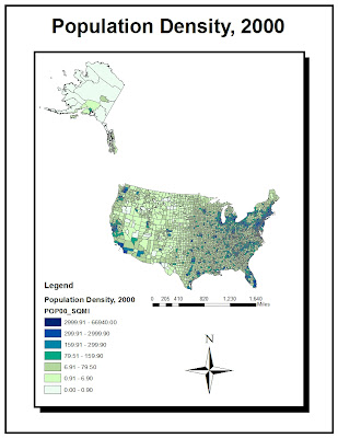
The fourth Map shows population density for the year 2000 in the United States. So it shows the number of people per area, another way to look at overall population distributuion by counties of the United States. If a large county is relatively lighter it doesnt mean neccersarily that the county is very low in population it may just mean it is not as crowded, which means if a small county is the same color it is not more populated but just more crowded. This map shows us that New York City, Chicago and Los Angeles are three very populated regions.
 
 
These four Census maps based on the United States help to show population if diffrent ways. They provide a very quick and efficient way to see how population is changing and where it is greatest. This Lab allowed me to apply some of the skills I have learned and build new skills on top of them also. It helped to show me how GIS is applied into the real world in it normal every day efficent use. Census data is very important in almost every aspect of life and displaying it in a easy and quick visual way, like the four maps above, is very useful.


Tuesday, November 13, 2012

DEM


The area displayed above is south of Boulder in Colorado right around Golden Gate Canyon State Park. For the area displayed above the extent information (in decimals) is, Top: 39.8291666661, Left: -105.788888889, Right: -104.969444445, and Bottom: 39.3838888883. Information on the geographic coordinate system for the area displayed above; Spatial Reference, Datum North American 1983 with angular unit Degree (0.0174532925199433). Each of these maps above show valuable information about the aspect or the direction at which each slope face, slope inclination, hill shade or elevation, and a 3-D image of the area.

Tuesday, November 6, 2012

Map Projections: Equidistant, Equal Area, Conformal


Map Projections

 Map Projection is the process of converting a spherical model on to a planar model, which makes it easier to view the whole world at once. In this process you have some trade-offs to make though. What features such as, distance, area, and direction of your map do you need to reamin accurate and which ones can be distorted. There is no way to portray a perfectly depicted map with no distortion on a flat surface. Distortions can be dealt with and researchers have studied hundred of diffrent kinds if maps to categorize them into three specific types to make it easier for people to pick the map that has acurracy in the feature they need. When choosing a map you have to look at your problem and see if it need accuracy in distance, direction, area, or angles. Which is the most important and which is the least important. Then you can choose whihc will be the most helpful; conformal projection, equidistant projection, or equal area projection.
 
Conformal map projections are most frequently employed in large scale maps such as topographic maps or navigationals maps. Conformal maps preserve shape and local angles, creating a system of longitude and latitude gridlines. Conformal maps also lead to accuracy in local directions. Conformal maps arent often used on the world scale but can be helpful in comparing two countries or two continents such as the Americas.
 
Equidistant projections preserve distance when its is calculated from a designated point. Directions are all true from the center outward but shapes are all distored the further you get from the center. A equidistant projection is very useful for pilots who need to know the distance of a trip or an example we used in class was the korean missile crisis. How far does the missile need to be able to shoot to get to its designated target.
 
Equal area map projections preserve areas throughout the map but distorts shape and scale as you near the poles very badly. These maps are most efficient when studying tropical areas near the equator because there is very little distortion in any features. It can also be useful when comparing smaller regional areas because distortion remains on the same level for the whole area basically.
 
Transforming something from being three dimensional to two dimensional is not an easy task and of course there is going to be trade offs involved in the process. Yes there are positives and negatives in map projections varying on the three categories. As a researcher you need to know which projection has the features most suitable for your study.